Prints! Prints! Prints!
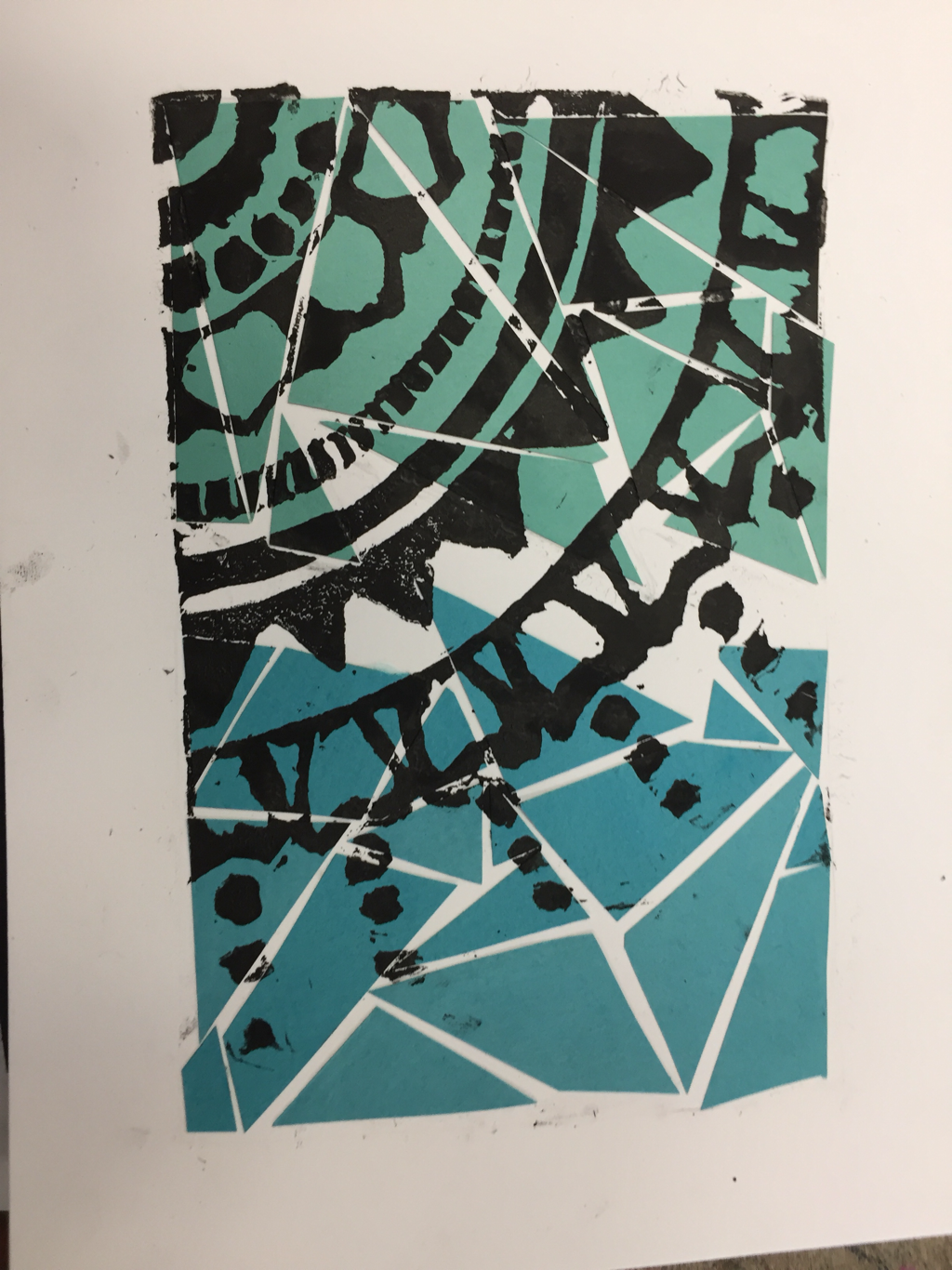
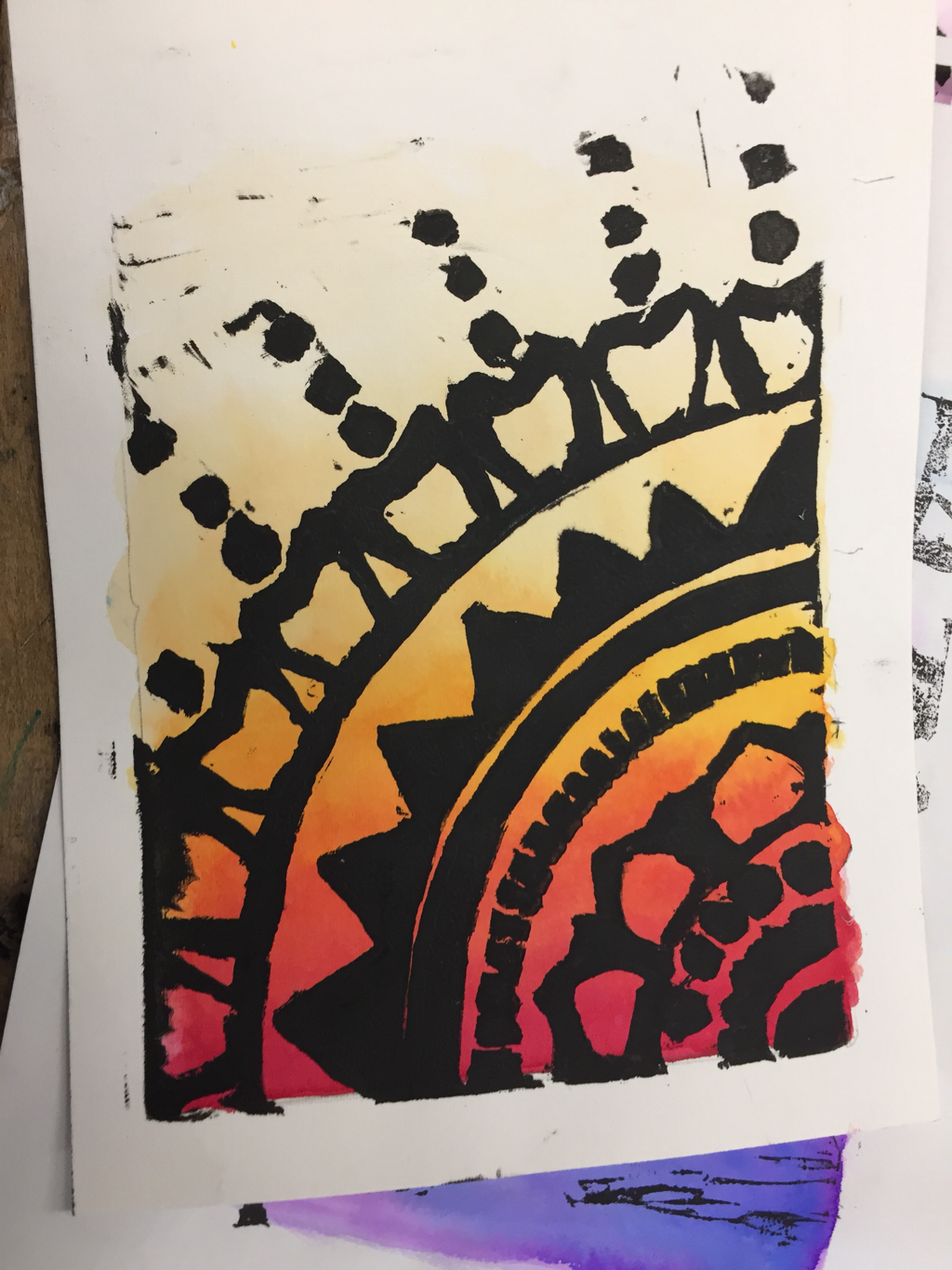
In art class we had the great opportunity to make prints! Printmaking is the exercise of making a design or picture on a special and prepared block. We came up with our own individual designs and transmitted them to our blocks with mod podge to transfer it. My design was very detailed and decided use image transfer and some drawing. I transferred a photoshopped copy of my design to my soft block and carved out the negative space. We made multiple drafts, and after we carved and perfected our blocks. . Then we took carving tools and used them to carve out the negative space for our stamp. After that ,we made our first proof with block printing ink and started making small edits to improve the stamps quality. To make the prints, we used block printing ink and used a brayer to spread it on plexi glass to smooth it out. After we got our stamp perfect, then we started trying new stamp techniques like chine colle and a la poupee. I personally really liked the water color technique because I had control of the intensity of the colors.
|
|
|
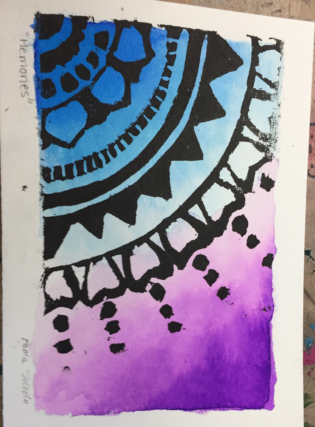
One fourth by Paola Toledo
This print represents me in various ways. In a way that only art can explain it. A way that it is indescribable. This piece displays my thoughts and memories. I developed this style when I was in middle school and it brings me memories from back then. It represents me in the aspect of difference and simplicity. I am a very simple and open minded person and I think this piece really portrays that. It includes patterns, which to me is organized, and it somehow shows order and coordination. The negative space has also a special meaning. It outlines my future growth and open mindedness. Since this design has different layers, which can illustrate my type of personality, there’s also a space that doesn’t have layers. It can describe itself as a “work in progress”. The colors that I chose are my favorite colors, blue and purple. I think that these two work well together since they’re next to each other according to the color theory and seems to blend very well . I feel like when I see this piece your brain automatically pictures the rest of the piece. I see my piece as a fourth of something and my head automatically sees the rest. This can also symbolize how there’s more to my character and personality. I think that there’s always more to a person, there’s something that they hide behind their daily faces and words and the things we observe are only a “fourth” of them. I made this design because I love patterns and it makes it look organized, not like I want everything in order but it's somehow satisfying. I decided to get rid of some patterns in the process because carving thin lines can be complex. Although, with all of the removal I am proud of the final outcome. I wanted something simple and I came up with some patterns. I wanted the design to start the bottom corner of paper so I could add and form something from there. It's like a small part of a mandala. It's all about following the rhythm, lines and contrast, which leads to the intricate geometric composition.
Yo soy la simplicidad de las diferencias.
Yo soy los colores en orden que siguen su destino.
Yo soy el recuerdo valioso
Yo soy el aire que viento en los días frescos.
Yo soy una pieza buscando su lugar
Yo soy una mente abierta
Yo soy un cuarto
